Understanding Colour Brochure Printing
Colour brochure printing is a fundamental component of visual marketing strategies, designed to communicate brand messages with vivid clarity and professional appeal. This printing process involves producing multi-page printed materials that are rich in color and detailed imagery, serving to attract, inform, and persuade target audiences effectively. The significance of colour brochure printing extends beyond mere aesthetics; it plays a pivotal role in shaping brand perception, establishing credibility, and facilitating product or service promotion.
Colour brochures are versatile marketing tools that can be customized to fit various business types and sectors. From corporate presentations and real estate portfolios to retail advertisements and event promotions, these printed materials are tailored to meet specific branding objectives. High-quality colour printing ensures that logos, photos, graphics, and text are presented crisply and vibrantly, which helps to make a memorable impression.
The choice of colours in a brochure is strategic, carefully selected to evoke emotions, convey messages, and align with brand identity. Consistent use of colour across different marketing channels boosts brand recognition and fosters trust among consumers. Additionally, colour brochures are an excellent means to highlight features, benefits, and unique selling points through visually appealing layouts and striking visuals.
In an increasingly competitive marketplace, the importance of well-designed, professionally printed colour brochures cannot be overstated. They serve as tangible, lasting representations of a company or product, often retained for future reference, thus extending their marketing impact. Selecting a trusted printing provider ensures that the final product meets high standards of quality, durability, and visual fidelity, ultimately contributing to successful marketing campaigns.
Understanding the Role of Color Management in Colour Brochure Printing
Achieving precise and consistent color reproduction is vital for the effectiveness of a colour brochure. Color management encompasses a series of processes and tools that ensure the colors seen on a designer’s screen match the printed output. This involves calibrated monitors, standardized color profiles, and controlled printing environments that minimize color variations.
Implementing an effective color management workflow begins with accurate color profiles embedded in design files, such as ICC profiles, which communicate how colors should be interpreted across different devices and media. When a printer or printing service adheres to strict color management protocols, the final product will display the intended hues, contrasts, and tonal ranges, ensuring that your brand’s visual identity is faithfully represented in every print.
In the production of colour brochures, specialists often utilize high-performance color calibration tools and software to monitor and adjust color output regularly. This rigorous approach helps prevent issues like color shifts or dullness, which can undermine branding efforts and diminish visual appeal.
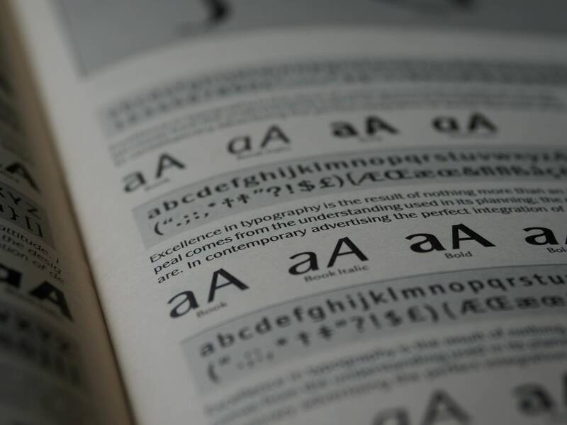
Furthermore, understanding the differences between color models—such as RGB (used for digital screens) and CMYK (used for printing)—is crucial. Print professionals convert digital designs from RGB to CMYK using proper color profiles, which influences how colors are rendered on paper. This conversion process requires expertise to prevent undesirable color shifts and to ensure vibrancy and consistency across different print runs.
Working with a printer that employs advanced color management techniques guarantees that the vibrant reds, deep blues, and subtle gradients in your brochure are reproduced with fidelity. This precision not only enhances the visual impact but also sustains the perceived quality, reinforcing the credibility of your brand or message in the minds of your audience.
Ultimately, meticulous color management contributes to a cohesive visual experience where your colour brochure becomes a powerful marketing tool, accurately communicating your intended message while reflecting your brand's professionalism and quality standards.
Optimal Techniques for Producing High-Quality Colour Brochures
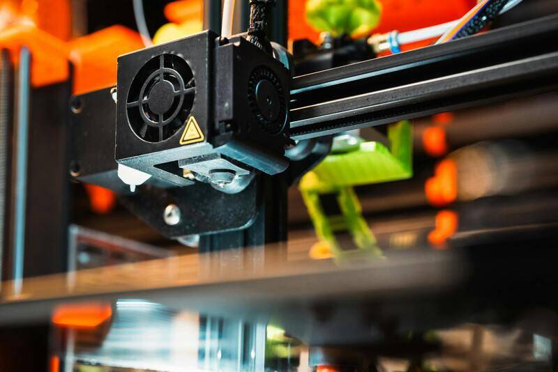
Achieving stunning colour brochure prints requires more than just selecting vibrant hues; it involves the application of advanced printing techniques that ensure accuracy, consistency, and durability. Digital printing remains a popular choice due to its ability to produce high-resolution images with precise colour reproduction, especially suitable for short to medium print runs. This method allows for quick turnaround times and flexibility in customization, making it ideal for marketing campaigns that demand timely execution.
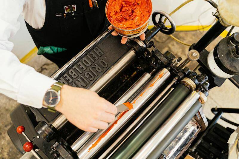
Offset printing, on the other hand, is renowned for its capability to handle large volumes while maintaining superior colour fidelity and sharp detail. This process uses metal plates corresponding to each colour in the CMYK spectrum, which transfer ink onto the paper through a series of rollers. Offset presses typically provide more consistent results across extensive print runs, maintaining consistency in colour matches and print quality.
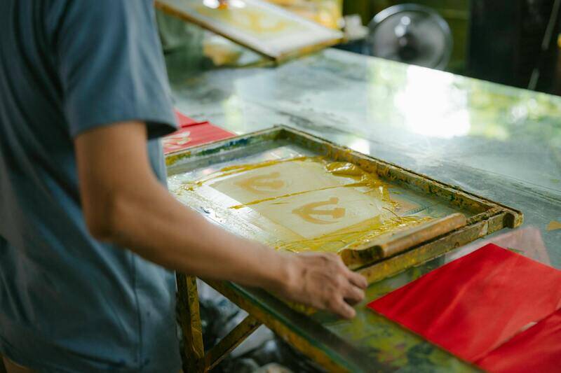
Specialty printing techniques—such as spot colour printing—are employed when brands require exact colour matches beyond the four standard process colours. Spot colours involve custom mixed inks, allowing for exact replication of logos or brand-specific shades. Incorporating varnishes or coatings can further enhance the visual appeal by adding gloss, matte finishes, or textured effects that elevate the tactile experience of the brochure.
The choice of binding method also influences the overall presentation. Saddle stitching is common for shorter brochures, providing a clean, professional look, while perfect binding or spiral binding is used for more substantial publications, ensuring durability and a polished appearance.
By aligning these printing techniques with the specific objectives of a brochure, businesses can produce material that captures attention, communicates their message effectively, and aligns with branding standards. Collaborating with experienced printers ensures that the selected techniques are executed flawlessly, ultimately resulting in a brochure that stands out both visually and in quality.
Color Management and Accuracy
Achieving precise color reproduction is essential in colour brochure printing, especially when brand consistency and visual impact are priorities. Proper color management involves controlling how colors are represented across different devices and print processes. This begins with the use of color profiles tailored for the specific printing method and paper type, ensuring that the vibrant hues intended in the design come out accurately on the final product.
To enhance color fidelity, professional printers employ software solutions that calibrate monitors, scanners, and printers—enabling a seamless transfer of colors from digital files to physical prints. This calibration process minimizes color shifts and ensures that the artwork matches the original concept as closely as possible.
Furthermore, standardizing the color specifications through well-defined Guidelines—such as Pantone matching for spot colours—can provide consistency across multiple print runs. When brand colours are critical, implementing spot colour printing and maintaining strict proofing procedures allows clients to verify color accuracy before mass production, reducing costly reprints.
Details of Professional Colour Brochure Printing Processes
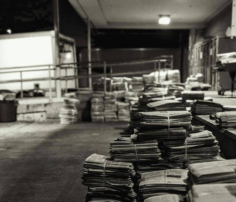
Colour brochure printing involves several meticulous steps designed to produce vibrant, accurate, and consistent images that reflect the original design intentions. Established printing processes leverage advanced technology and industry-standard practices to achieve the desired quality. One critical method is the use of high-resolution digital or offset printing, both capable of reproducing detailed imagery and vivid hues with clarity. Offset printing, in particular, is favored for larger quantities due to its precision and cost-efficiency, especially in producing consistent color output over multiple copies.
While traditional offset printing uses ink on paper, modern digital printing offers a quicker turnaround suitable for smaller batches or personalized brochures. These processes depend heavily on high-quality printing presses equipped with precise color management systems. The use of CMYK color models in printing enables the reproduction of a broad spectrum of colors, but it requires careful calibration to avoid mismatched shades or dull hues.
In tandem with the printing process, color matching techniques such as Pantone Matching System (PMS) are employed to achieve spot colours that are impossible to replicate with standard CMYK. These spot colours are particularly valuable for brand logos and specific design elements that demand exact hue replication. Integrating digital proofing and press checks allows designers and printers to verify color fidelity, making adjustments before the final run to prevent costly errors.
Adding to this, techniques like embossing, laminating, and spot varnishes are often used to create tactile and visual effects that elevate the brochure’s appeal. These finishes can accentuate colours and details, ensuring the brochure stands out in competitive marketing landscapes. The choice of paper stock and finishes directly impacts the vibrancy of colours—glossy paper tends to enhance brightness, while matte finishes offer a subdued, elegant effect. The combination of suitable paper and finishing techniques plays a significant role in the overall impact of the colour brochure.
Ensuring consistent colour reproduction across large runs also involves strict quality control measures. Regular calibration of equipment, adherence to proofing standards, and continuous monitoring during print runs are essential practices. This comprehensive approach guarantees the final product’s colours align with the initial design intent, thereby supporting the professional reputation of the brand and the effectiveness of the marketing message.
Ensuring Color Accuracy Through Proper Calibration and Proofing
Maintaining consistent and precise colors in colour brochure printing hinges on meticulous calibration of printing equipment. Regular calibration of printers ensures that the ink output aligns with the intended color profile, reducing discrepancies between the digital design and the physical print. Advanced colour management systems are employed to standardize colour reproduction across different devices, enabling seamless consistency during large-volume productions.
Beyond calibration, incorporating digital and hard copy proofs significantly enhances colour fidelity. Digital proofs allow designers to preview how colours will appear once printed, providing an initial checkpoint for adjustments. Hard copy proofs, or press proofs, involve printing a sample run to evaluate colour accuracy in real-world conditions. By carefully reviewing these proofs, stakeholders can identify any deviations from the desired palette, thus implementing necessary corrections before proceeding with the full production run.
This systematic process minimizes costly reprints and ensures the final product reflects the original visual concept. Moreover, consistent monitoring during the print run allows operators to detect and correct any colour shifts, preserving the integrity of the design throughout the production cycle. Such rigorous quality control methods are essential for delivering a professional-grade brochure that effectively communicates the brand message with vibrant, true-to-design colours.
Advanced Printing Techniques to Maximize Colour Impact
Implementing innovative printing techniques plays a critical role in enhancing colour vibrancy and detail in brochures. Techniques such as UV coating not only add a gloss finish but also intensify the colours, making images pop and text stand out. Similarly, spot varnishing permits selective application of gloss or matte finishes on specific areas, creating a contrast that highlights key design elements and adds depth to the overall presentation.
Embossing and debossing further contribute tactile elements that complement rich colours, offering a multisensory experience for viewers. These techniques require precise alignment and high-quality execution but result in brochures that are visually captivating and memorable. When combined with high-quality paper stocks and careful colour management, these methods produce brochures that reflect professionalism and attention to detail.
Integrating metallic and specialty inks also provides opportunities to introduce unique hues and reflective effects, further elevating the brochure’s aesthetic appeal. Each of these techniques demands specialized equipment and expertise, underscoring the importance of partnering with an experienced printing service capable of executing complex colour and finishing effects with precision. The resultant product not only communicates the intended message but also leaves a lasting impression through vivid colours and striking visual effects.
Ensuring Color Consistency and Accuracy Throughout the Printing Process
Achieving accurate and consistent colours in your brochure is crucial for maintaining brand integrity and ensuring your visual communication resonates effectively with your target audience. This begins with meticulous color management strategies that encompass every stage of the production process, from digital design to final print. Employing professional colour management tools, such as ICC profiles, allows print providers to calibrate monitors and printers, aligning digital colours with printed results with precision.
Pre-press proofing plays a vital role in colour fidelity. Digital proofs or hard proofs enable clients to review the colour output before full-scale production, providing an opportunity to make necessary adjustments. These proofs should be created using calibrated equipment to reflect the final print's colour accuracy closely. When adjustments are needed, designers and printers can collaborate to tweak hues, saturation, and contrast to ensure the final product matches the original vision.
Many printing techniques pose specific challenges in colour reproduction. For example, maintaining vibrancy and accurate hue reproduction when printing saturated colours or gradients requires expertise and careful calibration. Techniques such as spot colour matching or using custom colour palettes can address this, particularly when specific brand colours must be consistently reproduced across multiple batches. Regular quality checks during printing — including colour sampling and on-press inspections — help catch discrepancies early, preserving the integrity of the brochure’s visual appeal.
Another key aspect involves selecting appropriate inks and substrates. High-quality, colour-accurate inks combined with compatible paper stocks enhance colour richness and sharpness. Using coated finishes, such as gloss or satin, can also influence vibrancy, enriching the colour depth of images and graphics. Clear communication between clients and print providers about expectations and requirements ensures that every detail, from ink density to paper choice, aligns perfectly to produce a brochure that faithfully represents the intended design.
Implementing comprehensive color control strategies ultimately results in brochures that are visually striking, on-brand, and professionally finished. Achieving this level of precision underscores the importance of working with experienced printing professionals who understand the nuances of colour reproduction and possess the tools and expertise to execute complex projects flawlessly.
Understanding Colour Brochure Printing
Colour brochure printing involves more than merely selecting vibrant inks and eye-catching images. It encompasses a comprehensive process that ensures the final product accurately reflects your intended design with consistent, vivid colours. This process starts with meticulous pre-press preparations, including colour calibration and proofing, to guarantee the colours on your brochure match your brand palette or specific design choices. Colour accuracy is crucial for maintaining brand integrity, especially when exact shades are part of your visual identity. Therefore, understanding the technical aspects of colour management, including colour profiles and calibration procedures, becomes essential for producing professional-grade brochures that leave a lasting impression.
Choosing the Right Paper and Finishes
The choice of paper stock and finishes greatly influences the vibrancy and durability of a colour brochure. Heavier, coated papers—such as gloss or satin finishes—enhance colour richness and image clarity, making visuals pop and attracting viewers’ attention. Matte finishes offer a more subdued, sophisticated look, suitable for conveying elegance or subtlety. When selecting paper, consider factors like weight, texture, and compatibility with your printer’s ink systems. High-quality paper substrates can absorb inks evenly, reducing issues like smudging or colour bleeding, thereby ensuring sharp, accurate reproduction of colours and graphics. Finishing techniques such as lamination or spot UV coating can also add a layer of protection and a luxurious feel, elevating the overall presentation and extending the lifespan of your brochure.
Design Tips for Effective Brochures
Design precision directly influences how colours are perceived in printed brochures. To maximise impact, use a balanced colour palette that aligns with your brand identity, employing complementary hues to highlight key messages. High-resolution images and crisp graphics prevent pixelation and ensure colour details are accurately rendered. Incorporate sufficient contrast between background and text to improve readability and visual hierarchy. Embedding colour profiles within your design files ensures consistency across different viewing devices and when sent to the printer. Additionally, consider the layout’s flow to guide the audience naturally through the content, reinforcing your message visually. Opting for clean, uncluttered design elements allows your chosen colours to stand out and communicate effectively.
Emphasis on Brand Colour Consistency
Maintaining consistent colour across various marketing materials is vital for brand recognition. Using Pantone or similar colour matching systems can help achieve uniformity, especially when colour variations could lead to misinterpretations. Share specific colour values and design guidelines with your printing partner to ensure the final output remains true to your brand standards. Consistency in colour application enhances the professionalism of your brochure, building trust and reinforcing brand identity among your target audience.
Printing Techniques Used in Colour Brochure Production
Several printing techniques underpin the production of vibrant, colour-rich brochures. Offset printing stands out for its ability to produce high-quality, consistent colours on large print runs, making it ideal for business marketing materials. Digital printing offers flexibility for smaller batches, quick turnarounds, and quick adjustments to design or colour schemes. For particularly complex colour requirements, such as gradients or photorealistic images, techniques like four-colour process printing and spot colour matching are employed. UV coating and aqueous finishes add gloss and protection to enhance colour depth and longevity. Understanding the strengths and limitations of each method allows you to select the most suitable technique to achieve your desired outcome efficiently and with excellent visual fidelity.
Color Management and Accuracy
Ensuring colour accuracy in brochure printing necessitates rigorous colour management protocols. This involves using calibrated monitors, colour profiles, and proofing techniques that simulate the final output before full-scale production. Soft proofs help clients visualize colours accurately, while hard proofs allow for tangible reviews to spot discrepancies. During the actual print run, frequent quality inspections—such as colour sampling and press checks—ensure the colours remain true to the original design. Proper ink mixing, controlled printing environments, and precise calibration between digital files and printing presses are integral to consistent, reliable colour reproduction. Employing these practices results in brochures that faithfully showcase your visual identity and convey your messaging with clarity and vibrancy.
Cost Considerations and Budgeting
Budget planning for colour brochure printing involves balancing quality, quantity, and design complexity. Higher-quality papers, finishes, and advanced printing techniques typically entail increased costs but yield superior visual results. Bulk printing often reduces unit costs and allows for more comprehensive marketing campaigns. Alternatively, smaller runs or digital printing may be more economical for testing new designs or limited editions. Including detailed specifications in your brief and collaborating closely with your print provider ensures transparency and helps you avoid unexpected charges. Investing in quality materials and professional printing services usually results in a more impactful final product, generating better engagement and a higher return on your marketing efforts.