Understanding Colour Brochure Printing
Colour brochure printing is a specialized process that transforms digital designs into vibrant, tangible marketing assets. It involves the application of advanced printing technology to produce brochures that are rich in colour and high in quality, ensuring that visual elements such as images, graphics, and text are rendered with precision and clarity. These brochures serve as essential tools for businesses aiming to communicate their brand story, showcase products or services, and engage their target audience effectively.
Utilizing colour brochure printing allows organisations to present a polished and professional image. The vivid and nuanced colour outputs help highlight key messages, catch the eye of potential customers, and enhance overall brand recognition. Whether used for promotional campaigns, corporate presentations, or trade show handouts, colour brochures act as compact yet impactful marketing collaterals.
The role of colour brochure printing extends beyond mere aesthetics; it plays a vital part in establishing trust and credibility with the audience. By selecting appropriate colour schemes, layouts, and materials, companies can convey their brand identity and differentiate themselves in competitive markets. This process requires careful planning and execution, with attention to detail in colour consistency, paper choices, and print quality.
Primarily, colour brochure printing supports marketing strategies by creating a tactile, engaging experience that standard advertising methods cannot match. It allows brands to leave a lasting impression, fostering better engagement and recall among consumers. For businesses aiming to boost their advertising impact, investing in professional colour brochure printing ensures that their print materials stand out, resonate with viewers, and effectively communicate their core messages.
As a critical component of print marketing, colour brochure printing combines technological excellence with creative design. It bridges the gap between visual appeal and functional communication, making it an indispensable tool for any comprehensive branding and marketing plan. Choosing the right printing partner and adhering to best practices in design and production will ensure that each brochure effectively contributes to your business objectives, reinforcing your message across every printed piece.
Types of Printing Techniques for Colour Brochures
When it comes to colour brochure printing, selecting the appropriate printing technique is essential to achieve optimal clarity, colour vibrancy, and durability. Offset printing, digital printing, and large-format printing are the primary methods used in the industry, each offering distinct advantages suited to different project needs.
Offset Printing
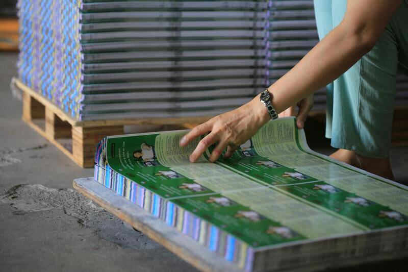
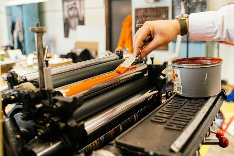
Offset printing remains the most popular choice for high-volume brochure production due to its ability to produce consistent, high-quality images with rich colours. This technique involves transferring ink from a plate to a rubber blanket, then onto the paper. It's ideal for large print runs where colour precision and print quality are paramount. The setup process requires creating plates for each colour, which can be time-consuming but pays off in cost efficiency for bulk orders.
Digital Printing
Digital printing offers a more flexible approach, allowing quick turnaround times with minimal setup. It is well-suited for short runs, customized brochures, or projects that require frequent updates. Although the cost per unit may be higher compared to offset, digital printing provides excellent colour fidelity and can support variable data printing, enabling personalized content within each brochure.
Large-Format Printing
For brochures that incorporate oversized images, detailed graphics, or special visual effects, large-format printing delivers exceptional results. This method is predominantly used for displays or point-of-sale materials but can be adapted for certain types of brochures requiring large visuals or unique formats.
Choosing the right technique depends on factors such as project scale, budget, required quality, and turnaround time. Working with a professional print provider familiar with various technologies ensures that your colour brochures are produced using the most suitable method to meet your brand’s standards and campaign objectives.
Color Management and Accuracy in Printing
Ensuring that the colors in your brochure match your brand’s palette is critical for maintaining consistency and professional appearance. Effective color management involves meticulous calibration of monitors used during the design phase, ensuring that digital colors translate accurately into printed hues. Standardized color profiles, such as CMYK (Cyan, Magenta, Yellow, Key) color space, are employed to guarantee consistency across various devices and printing processes.
Print providers often utilize specialized software to convert on-screen designs into optimized print files. This conversion minimizes color deviations and ensures that the printed output reflects the intended color scheme. Additionally, the use of color calibration tools and proofing services, such as contract proofs or digital proofs, allows clients to preview the colors before the full run, making adjustments as necessary to achieve the desired vibrancy and accuracy.
Another important aspect is the choice of high-quality inks and substrates. Premium inks with a broad color gamut deliver richer, more vivid visuals, while using suitable paper types enhances color vibrancy and sharpness. For instance, glossy or satin finishes can intensify colors, making images pop, whereas matte finishes offer a softer, more subdued appearance, suitable for text-heavy brochures.
Working closely with experienced printing professionals ensures that all these factors—color profiles, proofing, ink selection, and paper quality—are optimized for accurate and consistent color output. This diligence results in a brochure that not only attracts attention but also faithfully represents your brand's visual identity, helping to reinforce recognition and trust among your audience.
Choosing the Right Paper and Finishing Options
When it comes to colour brochure printing, selecting the appropriate paper stock and finishing options plays a crucial role in achieving the desired aesthetic and functional results. The choice of paper impacts not only the visual vibrancy of the colours but also the tactile experience and durability of the brochure. Heavier weight papers such as 150gsm or higher are often preferred for premium brochures, offering a sturdy feel that enhances perceived quality. Glossy or satin finishes tend to amplify colour brightness and contrast, making images stand out with vivid clarity. These finishes are particularly suitable for brochures that heavily rely on high-impact visuals, such as product showcases or portfolio presentations.
Matte finishes, on the other hand, offer a soft, subdued look with reduced glare, which is ideal for text-heavy or informational brochures that require easy readability. Additionally, specialty coatings like soft-touch or UV coatings can provide a unique tactile experience, giving your brochures a luxurious feel while also offering protection against scratches and fingerprints. Lamination options are also available for added durability and moisture resistance, ensuring the brochure maintains its quality over time, especially in environments with handling or exposure to elements.
The selection of appropriate paper and finishes should align with the purpose of the brochure and the message you aim to communicate. For instance, a high-gloss finish with thick stock is excellent for promotional materials that need to captivate attention immediately, while a matte or uncoated paper might be better suited for detailed informational content that benefits from reduced glare and easier writing options on the surface.
Color Management and Accuracy in Printing
Maintaining consistent and accurate colours throughout the printing process is essential for brand integrity and visual impact. Proper color management begins with the use of standardized colour profiles, such as ICC profiles, which help translate digital designs into physical prints. These profiles ensure that the colours in your brochure match your intended design across different devices and printers. When preparing files for colour brochure printing, it is vital to work within the CMYK colour space, which accurately predicts how colours will appear once printed.
Employing calibration tools and proofing services provides additional layers of assurance in colour fidelity. Digital proofs allow you to review the colour output on-screen or as a pre-print sample, enabling necessary adjustments before committing to a full run. This process minimizes costly reprints due to colour mismatch or inconsistencies.
For larger print runs, working with a printer that practices strict colour calibration and offers high-quality inks ensures that colours remain uniform across multiple copies. Bright, vivid colours are often achieved through the use of broad-gamut inks and high-quality substrates, which contribute to the clarity and vibrancy of printed images. Adopting these best practices in colour management guarantees that your brochures consistently reflect your brand's visual identity, helping to establish trust and recognition among your target audience.
Methods to Ensure Colour Consistency and Accurate Reproduction
Achieving precise and dependable colour reproduction in brochure printing requires a combination of strategic planning and adherence to best practices in colour management. The core objective is to ensure that the colours seen in the digital design are faithfully represented in the final printed product, which is vital for maintaining brand integrity and visual coherence across marketing materials.
One primary method involves utilizing standardized colour profiles, specifically ICC profiles, during the pre-press phase. These profiles serve as a reference point that translates digital colours into printable inks and substrates, reducing variations caused by different devices or printing conditions. When preparing files for colour brochure printing, it is essential to work exclusively within the CMYK colour space, as this accurately simulates the final printed colours, as opposed to RGB, which is suited for digital screens.

In addition to colour profiles, proper calibration of printing equipment plays a crucial role. Regular calibration of printers, monitors, and proofing devices guarantees that colours are reproduced consistently. High-quality calibration tools, such as spectrophotometers, can measure and adjust colour output precisely. This calibration process minimizes the risk of colour shifts, ensuring that every batch of brochures maintains the same vibrant and accurate colours.
Provision of physical and digital proofs is another critical step. Digital proofs, generated via colour calibration software, enable designers to review and approve colour accuracy before printing. Physical proofs or samples provide a tangible reference, allowing for real-world assessment of colours and materials. When discrepancies are identified, adjustments can be made for subsequent print runs, thus saving costs associated with reprints.
For large-volume print orders, partnering with printing providers equipped with advanced calibration protocols and premium inks ensures uniformity across the massive production. Employing high-gamut inks capable of reproducing a broad spectrum of colours yields more vibrant and true-to-design visuals. The choice of substrate also impacts colour accuracy—glossy or satin finishes tend to enhance colour richness, while matte finishes may soften tones but offer superior UV resistance and tactile appeal.
Ultimately, the integration of colour management systems, meticulous calibration, and thorough proofing creates a reliable framework for producing colour brochures that faithfully communicate brand messaging and visual identity. This technical diligence provides peace of mind that the final product will meet expectations in colour clarity, vibrancy, and consistency, regardless of the volume or complexity of the print run.
Understanding Colour Brochure Printing
Colour brochure printing remains a vital component of marketing strategies for businesses aiming to present a vibrant and compelling visual identity. It involves the application of advanced colour management systems to ensure that the final print reflects the design's intended hues with precision. This process is critical for brands that rely on accurate colour reproduction to communicate their message effectively, whether it’s in the technology, fashion, hospitality, or retail sectors. The selection of high-quality printing techniques and materials plays a pivotal role in delivering brochures that stand out, attract attention, and reinforce brand recognition.
Types of Printing Techniques for Colour Brochures
Several printing methods are available for producing colourful brochures, each suited to different needs and budgets. Offset printing is renowned for its high-quality output and cost-effectiveness in large volumes. It employs plates to transfer ink onto paper, ensuring sharp images and consistent colour reproduction across every copy. Digital printing offers flexibility for shorter runs and rapid turnaround times, making it ideal for customized or limited editions. It also provides accurate colour matching through sophisticated calibration, although the colour vibrancy can sometimes vary compared to offset printing.
Screen printing, although less common for brochures, can be used for specialty effects such as gloss overlays or metallic inks. UV printing technology enhances colour depth and durability, particularly on non-paper substrates. The choice of technique depends on factors including the desired visual impact, production volume, budget, and specific finishing requirements.
Design Best Practices for Colour Brochures
Effective design is integral to maximizing the impact of colour brochures. Designers should prioritize consistent colour schemes aligned with brand guidelines to foster brand recognition. The use of high-resolution images and carefully curated colour palettes enhances visual appeal. Balancing text and imagery is essential; vibrant colours should complement content without overwhelming it.
Additionally, employing contrast effectively ensures readability across various lighting conditions and viewing distances. Incorporate white space strategically to provide visual breathing room and highlight key messages or call-to-actions. When designing for colour, always consider the impact of different finishes and paper textures, as these can alter the perceived vibrancy and mood of the colours used.
Choosing the Right Paper and Finishing Options
The selection of paper stock influences both the aesthetic and tactile qualities of a brochure. Glossy or satin finishes accentuate colour richness and lend a premium feel, making them suitable for high-end brands. Matte finishes, while softening colours slightly, offer superior resistance to fingerprints and are preferred for understated elegance. Thickness and weight of paper—such as 150gsm or higher—contribute to durability and perceived quality.
Finishing options such as coating, lamination, or embossing add visual and tactile appeal, enhancing the brochure’s overall impact. A UV coating can provide extra shine and protection against wear, while matte lamination may offer a subdued, sophisticated look. Spot UV effects can be applied selectively to emphasize specific design elements, creating a layered, compelling visual narrative.
Color Management and Accuracy in Printing
Maintaining color accuracy throughout the printing process involves meticulous calibration of equipment and adherence to standardized colour profiles. Before production begins, digital colour proofs are generated to verify that the design translates accurately from screen to print. Physical proofs—or samples—are examined under controlled lighting conditions to assess colour fidelity and material compatibility.
High-end printers employ colour management systems that utilize ICC profiles, ensuring consistency across large runs and different production batches. Employing premium inks with broad colour gamuts enhances vibrancy, especially for designs requiring rich reds, deep blues, or luminous yellows. The choice of substrate contributes significantly; glossy or satin papers tend to preserve colour vibrancy more effectively than matte surfaces, which can mellow tones but offer better resistance to environmental factors.
Continuous calibration and quality assurance protocols—such as regular equipment checks and colour simulation software—are fundamental in generating brochures that stay true to original designs. This rigorous approach minimizes discrepancies and guarantees that each batch maintains high standards of colour fidelity, ultimately supporting the brand’s visual identity and marketing objectives.
Understanding Colour Brochure Printing
Colour brochure printing is a critical component for conveying a brand's message visually engagingly and professionally. To achieve excellence in printing, it’s essential to understand the official methods and standards that ensure high-quality results. Reliable printing practices focus on precise colour reproduction, consistent quality, and durability, all of which are supported by validated industry methods. These methods include digital printing, offset printing, and UV printing, each suited for different volume requirements and design specifications, while maintaining strict adherence to color management protocols. Properly executed colour brochure printing not only enhances visual appeal but also sustains brand integrity across various marketing channels.
Types of Printing Techniques for Colour Brochures
- Digital Printing: This method uses digital files directly fed into high-end printers, enabling quick turnaround and cost-effective small batch production. Digital printing ensures vibrant colour accuracy and flexibility for customized or variable data designs, making it ideal for limited editions or personalized brochures.
- Offset Printing: Recognized for its superior quality and consistent colour reproduction, offset printing involves transferring ink from plates onto a rubber blanket before printing on paper. It is most suitable for large-volume runs where colour fidelity and detail are paramount. The process supports the use of Pantone colours and precise colour calibration, ensuring each brochure aligns perfectly with design specifications.
- UV Printing: Utilizing ultraviolet light to cure inks instantly, UV printing produces exceptionally vibrant colours with a glossy finish. It offers high durability and is often used for specialty brochures requiring unique surface effects or detailed finishes that highlight specific design elements.
Design Best Practices for Colour Brochures
To maximize the visual impact, design professionals follow official color guidelines that prioritize clarity and harmony. Ensuring sufficient contrast, judicious use of white space, and optimal colour combinations are fundamental. Consistency across various spreads is maintained through the use of standardized colour profiles, uniform typography, and layout principles that guide the viewer’s eye naturally. Including high-resolution images and vector graphics, aligned with the print specifications, guarantees sharpness and vibrancy. Advanced design software—respecting industry standards—enables precise control over colour settings, ensuring the digital layout will translate accurately to the printed medium.
Choosing the Right Paper and Finishing Options
Material selection significantly influences the tactile and visual appeal of a brochure. Official paper options include gloss, satin, matte, and textured finishes, each with unique characteristics that complement specific design goals. Glossy papers emphasize vibrancy and sharp details but may reflect light, while matte surfaces offer a sophisticated look with reduced glare, enhancing readability. Finishing techniques—such as lamination, spot UV coating, embossing, or foil stamping—add depth and texture, making key elements stand out. These options not only elevate aesthetics but also contribute to the durability and perceived value of the printed brochure, aligning with professional standards and customer expectations.
Color Management and Accuracy in Printing
Maintaining colour consistency involves rigorous control and standardization across the entire printing process. Industry-accepted colour profiles, such as ICC profiles, facilitate accurate mapping of colours from digital files to printed output. Digital proofs and physical samples serve as checkpoints to verify colour fidelity before mass production. Reliable printing facilities employ calibrated equipment, quality inks, and premium substrates to reproduce colours vividly and precisely. Monitoring environmental conditions, such as humidity and temperature, during printing further ensures that colours remain consistent across different production batches. This meticulous approach guarantees that your brochure's colours are true to your brand, supporting a professional image that resonates across all marketing touchpoints.
Legal and Regulatory Standards for Colour Brochure Printing
Adhering to legal standards and industry regulations is essential for maintaining quality, safety, and compliance in colour brochure printing. Regulations often specify the usage of environmentally safe inks, sustainable materials, and proper labeling to inform consumers about content and materials used. Ensuring that printing processes meet these standards not only promotes responsible business practices but also enhances trustworthiness among clients and stakeholders. Certification schemes and adherence to environmental management standards such as ISO 14001 can serve as indicators of a printing service’s commitment to lawful and sustainable operations.
Moreover, compliance with packaging and advertising regulations safeguards against potential legal issues related to false advertising or misleading representations. Accurate depiction of products, services, and claims in brochures must align with applicable advertising laws to avoid disputes or penalties. This includes transparent messaging, truthful imagery, and verifiable claims that uphold consumer rights and fair competition practices. Working with printers who have a thorough understanding of these legal frameworks ensures that your colour brochure remains effective and compliant across all marketing channels.
Implementing quality control measures is fundamental to meeting legal standards. Established printing companies employ comprehensive checks throughout the production process—from pre-press preparations to final inspections—to ensure consistent colour accuracy, proper material handling, and defect-free output. These measures not only uphold legal requirements but also reinforce the overall quality and professionalism of your printed materials.
Additionally, maintaining meticulous documentation of the printing process—including proof approvals, material specifications, and compliance certificates—can be invaluable for accountability and future reference. This documentation demonstrates due diligence and provides proof of adherence should legal questions arise, thereby protecting your brand’s reputation and investments.
When selecting a service provider, inquire about their compliance practices, certification statuses, and their approach to legal regulations. A reputable printer will transparently communicate their adherence to relevant standards and provide assurances that your colour brochure will meet both aesthetic and legal expectations. Such diligence guarantees that your printed marketing materials not only captivate your target audience but also uphold the integrity and trustworthiness of your brand.