Importance of Business Cards in Networking and Branding
In today’s competitive commercial landscape, a well-crafted business card remains a vital tool for professionals seeking to make a lasting impression. Beyond merely exchanging contact details, business cards serve as a tangible reflection of one’s personal brand and company identity. They facilitate initial connections during networking events, conferences, and client meetings by providing a quick, accessible way to share essential information.
Effective business cards reinforce brand recognition through consistent use of logos, color schemes, and typography. When designed thoughtfully, they help establish credibility and trustworthiness, positioning your enterprise as professional and reliable. A high-quality card indicates attention to detail, fostering confidence among potential clients and partners.
The significance of a well-designed business card extends beyond aesthetics; it acts as a physical embodiment of your brand message. In environments where many competitors vie for attention, a memorable card with a clear, compelling design can distinguish your business and prompt recipients to contact you again. Properly executed, it enhances your professional image and helps build long-term business relationships.
Enhancing Professional Image & Credibility
Investing in quality design and printing demonstrates commitment and professionalism, giving your contacts confidence in your services or offerings. Additionally, a strategically crafted business card can serve as a mini marketing asset, communicating your company's core values and unique selling propositions at a glance.
Putting thought into how your business card represents your brand ensures it will be a useful tool for fostering credibility, expanding your network, and ultimately supporting your business growth. As the first point of physical contact with potential clients or partners, it plays a crucial role in creating a strong, positive impression that encourages ongoing engagement.
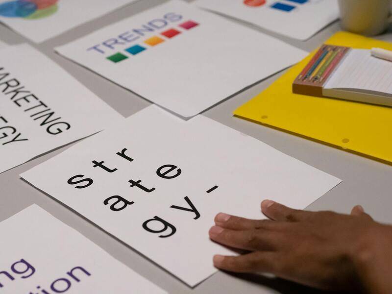
Choosing the Right Design for Business Cards
Determining the optimal design begins with understanding your brand identity and target audience. A well-designed card should reflect your company's ethos and appeal to the preferences of your prospective clients and partners. The layout must strike a balance between visual interest and clarity, ensuring that essential information stands out without appearing cluttered.
Typography choices play a vital role in making your business card legible and professional. Opt for fonts that align with your brand personality, whether that’s modern and minimalist or classic and elegant. Consistent font usage across your branding materials reinforces recognition and trustworthiness.
Color schemes should complement your overall branding strategy, considering color psychology and industry standards. For instance, technology companies might prefer sleek blues and grays, while creative agencies may opt for vibrant hues. Remember that contrast enhances readability, especially for contact details and call-to-action elements.
Incorporating your logo thoughtfully can establish brand consistency and make your card instantly recognizable. The placement of your logo should be prominent but not overpowering the contact details. Utilizing grid systems in your design layout ensures alignment and harmony, which contributes to an overall professional appearance.
Lastly, consider the use of visual elements such as icons or subtle patterns to highlight key information without distracting from the primary message. A clean and cohesive design enhances perceived value and encourages recipients to retain your card for future contact.
Selecting the Materials and Finishes
The material choice can greatly influence perceived quality and durability. Standard options include paper with varying thicknesses, but advancements in printing technology allow for specialty materials such as plastic, metallic substrates, or textured finishes. Thicker cardstocks convey sturdiness and premium quality, which can be advantageous when targeting upscale clients.
Matte finishes offer a non-glossy, sophisticated look and reduce glare, improving readability. Conversely, gloss finishes can create vibrant, eye-catching visuals, especially for photos or designs that benefit from a vivid appearance. Soft-touch coatings provide a luxurious feel, elevating the tactile experience and leaving a lasting impression.
Additional options include embossed details, foil stamping, or spot UV coatings, which add texture and visual interest. Embossing elevates certain elements, such as logos or key text, offering a tactile dimension that engages the recipient. Foil accents in gold, silver, or other metallic shades impart a sense of exclusivity.
Effective Use of Branding Elements
Integrating consistent branding elements across your business card reinforces your professional identity. This includes your logo, color palette, typography, and any taglines or imagery. Proper brand integration ensures that your cards seamlessly align with your overall marketing collateral, fostering brand recognition.
Position your branding elements thoughtfully to maintain balance and hierarchy. For example, placing the logo at the top corner or center ensures visibility. Contact details should be easily accessible, typically at the bottom or side, avoiding cluttered layouts that hinder quick comprehension.
Consistency in branding elements establishes a familiar visual language that enhances trust and recall. When recipients see a uniform style across all touchpoints, it solidifies their perception of your professionalism and stability.
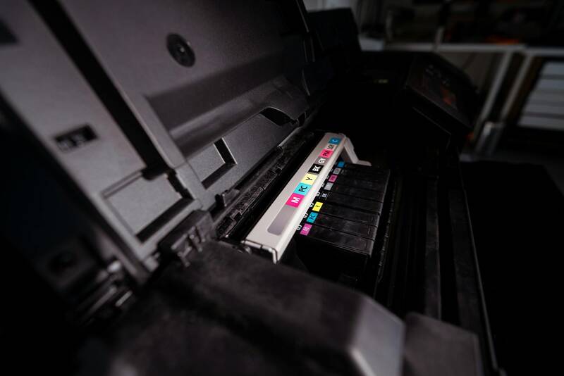
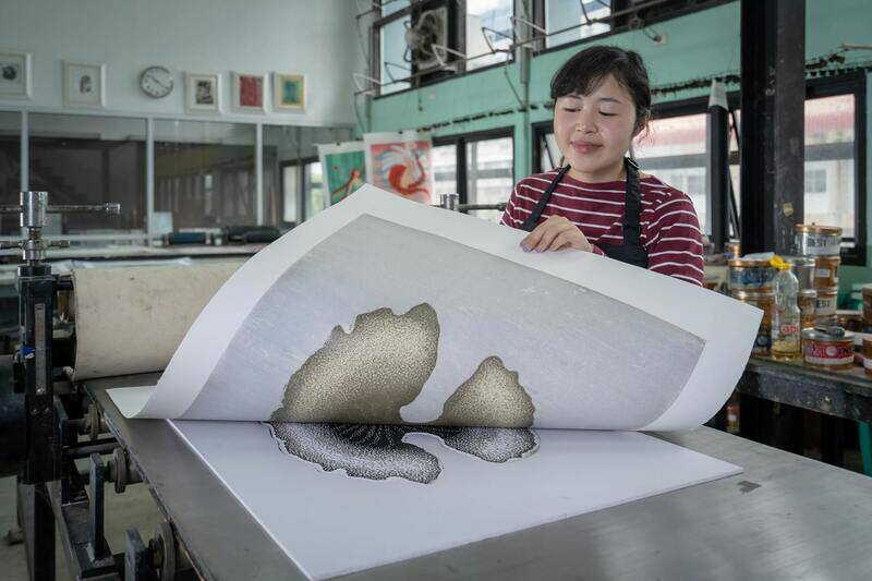
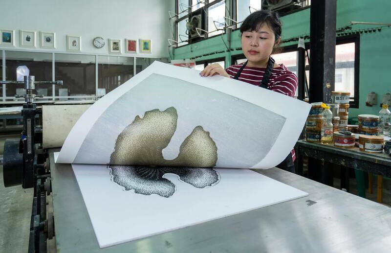
Printing Techniques and Pricing
Choosing the right printing technique can influence the final look and feel of your business cards. Digital printing is suitable for small quantities with quick turnaround times, providing excellent color accuracy and flexibility. Offset printing, on the other hand, is cost-effective for larger runs and offers high-quality, consistent results with finer detail and vibrant color reproduction.
Specialized techniques such as letterpress, foil stamping, or engraving add tactile depth and visual sophistication but may come at higher costs. These methods are ideal for premium branding or special editions that aim to make a memorable impact.
Pricing varies based on factors like design complexity, material selection, finishing options, and order quantity. When budgeting, consider not only the initial print cost but also the durability and perceived value of the finished product. Investing in higher-quality prints can deliver a better return by strengthening your brand image.
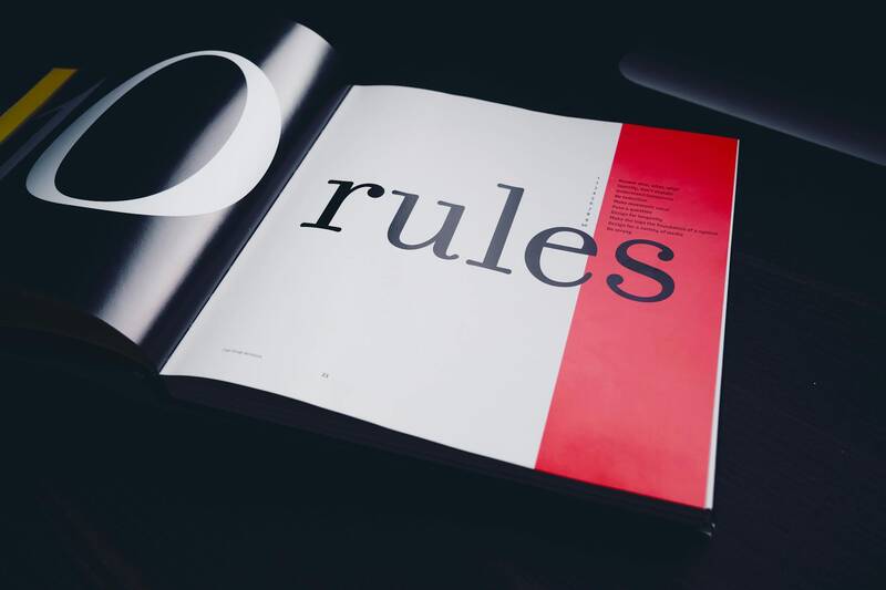
Design Best Practices and Common Mistakes
Adhering to proven design principles ensures that your business card communicates effectively. Maintain clear, legible contact information with ample whitespace to avoid overcrowding. Use a hierarchy of fonts and sizes to guide the recipient’s eye naturally towards essential details.
Avoid busy backgrounds or excessive visual clutter, which can detract from readability. Ensure that your logo and branding elements are proportionally scaled and aligned, preventing a skewed or unbalanced appearance. Consistency in style across all your cards and branding materials strengthens branding coherence.
Common pitfalls include using too many fonts, neglecting contrast, or overloading the design with irrelevant imagery. Attention to detail in spacing, alignment, and typography enhances professionalism and ensures your card leaves a polished impression.
Distribution and Maintenance of Business Cards
Efficiently distributing your cards involves strategic placement at networking events, meetings, and every professional interaction. Carry an ample supply to ensure you are always prepared to introduce your business. Keeping your cards up to date with the latest contact details and branding elements is essential for maintaining credibility.
Invest in a dedicated business card holder or organizer to keep your cards clean and pristine. Regularly review and replenish your stock to prevent running out, especially before major events or campaigns. Remember that your business card is an extension of your professional persona, so maintaining its quality and relevance reflects positively on your personal brand.
In the digital age, complement physical cards with digital contact sharing options, but do not underestimate the power of a well-designed, tangible business card as a memorable, trusted touchpoint that fosters ongoing connections.
Choosing the Right Materials and Finishes
When selecting the appropriate materials for your business cards, considering both durability and aesthetic appeal is essential. High-quality cardstock options typically range from 14pt to 32pt thickness, with thicker cards conveying a sense of sturdiness and professionalism. The weight and texture of the paper can influence first impressions—finer finishes embody elegance, while more robust materials suggest reliability.
Applying different finishes can significantly elevate the final look of your business card. Matte finishes are popular for their sophisticated, non-reflective surface that minimizes glare, making text easier to read and fingerprints less noticeable. Glossy finishes provide a vibrant, eye-catching appearance with enhanced color saturation, ideal for showcasing vivid branding elements or images. Textured surfaces, such as linen or embossed papers, add tactile appeal that can make your card stand out in a stack.
Incorporating specialty finishes like spot UV coating allows certain areas of your card—such as logos or key text—to gleam or stand out with a glossy overlay, creating a dynamic visual effect. Edgeless or rounded corners also contribute to a modern, sleek look, reducing the risk of scuffs and tears during handling.

Choosing the right combination of material and finish not only protects your card but also aligns with your brand’s identity and the impression you aim to create. For instance, a luxury brand might opt for textured or embossed finishes, while a tech startup might favor sleek, matte surfaces with minimal embellishments.
Effective Use of Branding Elements
Integrating branding elements seamlessly into your business card design reinforces brand recognition and professionalism. This includes consistent use of colors, logo placement, typography, and messaging. When these elements are balanced and thoughtfully arranged, they create a cohesive visual identity.
A well-planned layout ensures that your name, title, contact information, and branding symbols are easily readable and visually appealing. Avoid overcrowding by maintaining sufficient white space, which enhances clarity and draws focus to key details.
Utilizing branding elements consistently across all marketing collateral, including business cards, helps establish a trusted and recognizable presence. Simple, impactful designs often outperform cluttered ones, making critical information stand out at a glance.

Remember that the design should reflect your industry standards and personal style while maintaining professionalism. Incorporating unique visual cues related to your niche can also create memorable impressions, encouraging recipients to keep and refer back to your card.
Strategies for Incorporating Brand Logos, Brand Colors, and Messaging to Ensure Consistency and Strengthen Brand Identity
Creating a memorable business card hinges on the strategic use of branding elements that resonate with your overall corporate identity. Incorporating your logo seamlessly into the design is essential, serving as a visual anchor that instantly communicates brand recognition. Position your logo in a location that aligns with the visual flow of the card—typically upper left or centered—to enhance visibility without overcrowding the layout.
Consistent use of brand colors across your business card design reinforces your brand's visual identity. Select a color palette that reflects your company's personality—whether it’s vibrant and energetic or subdued and professional—and maintain this scheme across all marketing materials. This uniformity fosters immediate recognition and leaves a lasting impression.
Messaging on your business card should be clear, concise, and aligned with your brand voice. Incorporate a tagline or a core value proposition if space permits, providing recipients with a quick understanding of what your business represents. Use typography that complements your overall branding, opting for fonts that are legible and consistent with your visual identity. Hierarchical typography—highlighting key information such as your name and company name—guides the reader's eye naturally through the card’s content.
Effective integration of these branding elements turns a simple card into a powerful marketing tool that enhances your company's professionalism. When consistent branding is applied, it creates a cohesive look that makes your card recognizable and memorable in the minds of recipients.
Printing Techniques and Pricing
Choosing appropriate printing techniques is crucial to realize your design vision while adhering to budget considerations. Standard digital printing remains a cost-effective option suitable for small to medium quantities, offering quick turnaround times and good quality results. For higher-end finishes, options such as letterpress, foil stamping, and embossing elevate the tactile experience and visual appeal, yet they come with increased costs.
Pricing varies based on the complexity of the design, choice of materials, and finishing techniques. Basic designs with standard paper can start at competitive rates, while premium finishes and specialty papers can significantly increase the total expense. It’s essential to discuss your budget upfront with your printing provider to select the best options that align with your goals.
Design Best Practices and Common Mistakes
Successful business card design adheres to principles of simplicity, clarity, and relevance. Use a clean layout that avoids clutter and emphasizes essential information. Employ contrast effectively to ensure key details stand out, such as your name and contact info. Maintain ample white space to improve visual comfort and readability.
Common mistakes include overcrowding with excessive text or images, inconsistent branding elements, and poor choice of fonts or colors that reduce legibility. Avoid using overly small fonts or complex backgrounds that hinder the readability of contact information. Opt for high-resolution images and vectors to maintain sharpness across print sizes.
Designers should test the final layout by printing prototypes to assess readability, color accuracy, and overall visual impact. Gathering feedback from colleagues or industry peers can highlight areas for improvement before mass production.
Distribution and Maintenance of Business Cards
Effective distribution involves targeted sharing during networking events, client meetings, and industry conferences. Always keep a supply on hand and position your business cards within easy reach to encourage spontaneous exchanges. Consider pairing your cards with gifts or promotional materials to make a memorable impression.
Regularly update your business cards to reflect any changes in branding, contact information, or services. Proper storage is also crucial—keep your cards organized in dedicated cases or digital databases to facilitate easy access and replenishment. This proactive approach ensures your business cards remain a valuable tool in your marketing arsenal, reinforcing your professional image across all interactions.
Choosing the Right Design for Business Cards
Creating an impactful business card begins with selecting a design that aligns with your personal brand and industry standards. The design must effectively communicate professionalism while standing out amidst a sea of competitors. To achieve this, consider the layout, font choices, and overall aesthetic that resonate with your target audience.
Start with a layout that balances visual appeal and functionality. A clean, uncluttered design ensures that essential information—such as your name, title, company, phone number, email, and website—is easily readable. Incorporate white space strategically to avoid overwhelming recipients and to enhance overall clarity.
Typography plays a significant role in design. Choose fonts that are legible and reflect your brand's tone—serif fonts convey tradition and trustworthiness, while sans-serif fonts offer a modern, minimalist vibe. Avoid using more than two complementary font styles to maintain visual coherence.
Color schemes should reinforce branding and evoke the right emotional responses. Use brand colors consistently, but avoid overly vibrant or conflicting hues that distract from the essential details. Incorporate subtle contrasts to highlight key elements such as your name or logo.
Including unique design elements can enhance memorability. Consider integrating creative shapes, embossing, or foil accents to add tactile and visual interest. However, ensure that these embellishments do not compromise readability or functionality.
When designing a card for an industry like finance or legal services, a more conservative approach with traditional layouts and muted tones may be appropriate. Conversely, creative agencies or startups may benefit from bold designs and innovative visuals that showcase their brand personality.
Before finalizing your design, it’s crucial to evaluate how it appears in physical form. Printing a prototype allows you to assess the actual color rendition, font readability, and overall appearance. Gather feedback from trusted colleagues or industry mentors to identify improvements, ensuring the final product accurately represents your brand identity.
Keep your design adaptable to different formats and sizes. Responsive designs that translate well across various print finishes and materials ensure consistency in branding across all touchpoints. Importantly, consider future scalability—your card should remain relevant as your business evolves.
The goal is to craft a business card that not only carries essential contact information but also visually encapsulates your value proposition. A thoughtfully designed card acts as a portable extension of your brand, leaving a positive and professional impression on every recipient.
Design Best Practices and Common Mistakes
Crafting a business card that effectively communicates your brand while maintaining a professional appearance requires careful attention to design principles. Adhering to best practices can significantly enhance the card’s impact, ensuring that it serves as a reliable networking tool and a memorable branding element.
- Prioritize Readability: Select fonts that are clear and legible at various sizes. Avoid overly decorative typography that can impede quick recognition. Maintain sufficient contrast between text and background to ensure readability in different lighting conditions.
- Maintain Consistent Layout: Use a clean and logical arrangement of information. Typically, contact details like name, title, company, phone number, email, and website should be organized intuitively. Keep margins balanced, avoiding clutter or empty space that feels unbalanced.
- Utilize Visual Hierarchy: Highlight your name and company name through size, weight, or color. This guides the recipient's eye to the most important elements first, fostering quick identification and recall.
- Limit the Number of Elements: Keep the design simple by focusing on essential information and visual elements. Overloading a card with graphics or text can dilute your message and reduce overall professionalism.
- Use High-Quality Images and Logos: Incorporate sharp, well-designed logos and images to reinforce your branding. Avoid pixelated or stretched visuals that can appear unprofessional and diminish your credibility.
- Be Mindful of Margins and Bleed Area: Allow adequate margins to prevent crucial information from being cut off during trimming. Use bleed areas appropriately if your design extends to the edge of the card, ensuring a seamless, professional finish.
- Avoid Overly Trendy Designs: While keeping your design current is important, overly trendy elements may quickly become outdated. Aim for a timeless style that aligns with your brand personality and industry standards.
Common mistakes to steer clear of include inconsistent font choices, inadequate contrast, and overcrowded layouts. These issues can lead to confusion and diminish the overall professionalism of your business card. Additionally, neglecting to proofread meticulously before printing can result in costly errors, such as incorrect contact information or typos, which can harm your reputation and hinder future networking efforts.
Importance of Business Cards in Networking and Branding
Business cards are a fundamental tool for establishing professional connections and strengthening brand recognition. They serve as tangible representations of your personal and company identity, making a memorable impression on potential clients, partners, and collaborators. When distributed strategically, a well-designed business card can facilitate quick recall of your contact information and reinforce your brand message, positioning you as a credible and consistent professional within your industry.

Choosing the Right Design for Business Cards
Designing a business card that accurately reflects your professional image involves selecting elements that balance aesthetics with functionality. The overall layout should mirror your industry standards—sleek and minimalistic for corporate environments, or more creative and vibrant for industries like design or marketing. The choice of colors, fonts, and graphic elements should complement your brand’s personality, ensuring consistency across all marketing collateral. It’s essential to prioritize readability, clarity, and visual appeal, making it easy for recipients to find and remember key contact details.
Key Design Considerations
- Keep it simple: Focus on essential information, avoiding clutter that can overwhelm the recipient.
- Prioritize hierarchy: Arrange elements logically, emphasizing your name or company logo for instant recognition.
- Use professional fonts: Select clear, legible fonts that convey professionalism and align with your brand personality.
- Maintain consistent branding: Incorporate your brand colors, logo, and style to reinforce recognition.

Selecting the Materials and Finishes
The material quality of your business cards directly impacts their perceived value and durability. Common options include standard cardstock, which offers affordability and rigidity, and specialty papers like linen, textured, or matte finishes for a touch of elegance. Finishes such as gloss, spot UV, or matte coatings can elevate the visual appeal and tactile experience, making your cards stand out. When selecting materials, consider the industry context, your target audience, and the intended impression—luxurious finishes work well in high-end markets, while durable, water-resistant options suit mobile professionals or those in outdoor settings.
Effective Use of Branding Elements
To leverage your branding fully, incorporate visual elements that resonate with your overall identity. Your logo should be prominently placed yet harmoniously integrated into the design. Colors should align with your brand palette, creating consistency across all platforms. Typography choices should enhance readability while reflecting your brand’s tone—whether formal, innovative, or friendly. Incorporate subtle patterns or motifs related to your industry or brand story to add a distinctive touch without overwhelming the overall layout.
Printing Techniques and Pricing
Choosing the appropriate printing technique can dramatically influence the quality and visual impact of your business cards. Digital printing offers quick turnaround and cost-effectiveness for small batches, while offset printing provides higher quality and consistency for large runs. Specialty techniques like letterpress, foil stamping, or embossing lend a tactile dimension and a sense of exclusivity. Pricing varies depending on the complexity of the technique, material choices, and order volume. For optimal value, balance your branding aspirations with budget considerations, selecting a process that meets your quality standards while remaining financially feasible.
Design Best Practices and Common Mistakes
High-quality design execution is crucial to ensure your business card communicates professionalism. Adhere to best practices such as maintaining appropriate margins and bleed areas to prevent unwanted cropping. Use contrast effectively—dark text on light backgrounds enhances legibility. Limit font variations; generally, two complementary fonts suffice. Avoid overcrowded layouts, which can obscure key information and diminish impact. Before proceeding to print, thorough proofreading is essential to eliminate typos, incorrect contact details, or misaligned graphics, as these errors can compromise your reputation and hinder future interactions.
Ensuring the Authenticity of Your Business Cards through Official Printing Methods
To project a professional image and ensure your business cards are of the highest quality, it is essential to utilize certified and reputable printing services. Authentic printing methods involve working with established print providers that adhere to industry standards, guaranteeing consistent output, accurate color reproduction, and durable materials. By selecting recognized printers, you benefit from their expertise and access to advanced printing technologies that facilitate complex effects such as embossing, foil stamping, or spot UV coatings. These techniques not only enhance the tactile experience but also reinforce your brand's credibility and attention to detail.

Many professional printing companies in Singapore maintain strict quality control protocols. They utilize genuine printing equipment supplied by reputable manufacturers, ensuring color accuracy and consistent quality across all batches. Using off-the-shelf or unverified printers may result in subpar output, such as misaligned graphics or color mismatches, which can undermine your brand image. Reliable printers also follow industry-standard safety and environmental practices, often providing eco-friendly options for environmentally conscious businesses.
Benefits of Choosing Official and Proven Methods
- Quality Assurance: Ensures sharp images, vibrant color fidelity, and durable finishes that withstand wear and tear.
- Design Precision: Maintains accurate reproduction of intricate designs, logos, and typography.
- Consistent Results: Achieves uniformity across large print runs, reinforcing brand recognition.
- Legal and Ethical Compliance: Partners adhere to industry standards, providing transparency and accountability.
- Customization and Advanced Techniques: Access to specialty printing options like embossing, foil stamping, and die-cutting that elevate your business card's appeal.
Verification and Collaboration
When working with a printing provider, request samples of previous work to assess their quality and consistency. Confirm that the printer uses legitimate inks and materials approved for commercial use. Transparent communication on your requirements, including proofs and color approvals, helps ensure the final product meets your expectations. Establishing a partnership with certified printers can support your branding goals and safeguard your investment in high-quality business cards.
Protecting Your Brand Identity
Legitimate printing services also assist in maintaining brand consistency across all marketing collateral. They ensure that your logo, color schemes, and font choices are faithfully reproduced, reinforcing your visual identity. This consistency develops trust and recognition among clients and contacts, making your business cards a powerful networking and branding tool. Conversely, relying on uncertified methods may lead to compromised quality, which can negatively impact perceptions of your brand.
Properly executed, official printing methods form the backbone of a professional business identity. Always prioritize working with reputable printers that hold industry certifications and follow best practices. Such diligence guarantees your business cards genuinely reflect the caliber of your enterprise and leave a memorable impression in every transaction.