Understanding Colour Posters
Colour posters are powerful visual communication tools that utilize vibrant hues and striking imagery to convey messages, promote products, or enhance branding efforts. They serve as a dynamic medium in advertising, event promotions, educational campaigns, and corporate communications. The effectiveness of a colour poster heavily depends on its ability to capture attention quickly and deliver clarity in message through well-designed visuals and contrasting colours. In environments where visual impact can influence perceptions and decisions, colour posters stand out as an essential component of marketing strategies.
The primary characteristic of a colour poster is its utilization of multiple colours to evoke emotions, highlight key content, and create visual hierarchy. Bright and contrasting colours are often employed to draw the eye to specific details, such as a product, event date, or call to action. Additionally, the selection of colours can reinforce brand identity, evoke particular feelings, or align with thematic elements tied to the message being conveyed.
Common uses of colour posters include:
- Promoting upcoming events or campaigns
- Advertising products and sales
- Educational and informational displays
- Awareness campaigns for social causes
- Decorative artistic displays in public spaces
In high-traffic areas or crowded environments, the visual appeal of a well-designed colour poster is crucial. It must stand out amongst numerous other visual stimuli to effectively communicate its intended message. Therefore, the importance of vibrant, eye-catching designs cannot be overstated. A professionally printed colour poster enhances the perceived value of the message, making it more memorable and impactful.

Choosing the right combination of colours, imagery, and typography is essential for producing an effective colour poster. The visual elements should be balanced to avoid clutter while ensuring that the main message remains prominent. High-quality printing ensures that colours appear vivid and true to the intended design, further elevating the poster’s effectiveness.
Overall, colour posters are indispensable for engaging audiences and delivering impactful visual messages across various platforms and settings. Their success hinges on careful design, high-quality printing, and strategic colour choices that resonate with viewers and communicate the intended message convincingly.
Choosing the Right Printing Materials
To achieve the desired vibrancy and longevity of colour posters, selecting appropriate printing materials is essential. The choice of paper stocks, finishes, and substrates directly impacts the overall visual impact and durability of the final product.
High-quality paper stocks such as gloss, satin, or semi-gloss finishes are commonly preferred for colour posters due to their ability to enhance colour depth and richness. Glossy finishes, in particular, intensify colour vibrancy, making images appear more vivid and attention-grabbing, which is critical for promotional and advertising purposes. Satin finishes offer a balance between gloss and matte, providing a smooth surface with excellent colour saturation and reduced glare, suitable for indoor displays.

For outdoor posters or those exposed to weather elements, weather-resistant materials like coated vinyl or polyester substrates are recommended. These materials are designed to withstand UV rays, moisture, and extreme temperatures, ensuring that the poster maintains its visual integrity over time. Additionally, choosing thicker paper weights (such as 200gsm or higher) helps prevent tearing, creasing, or bending, especially when posters are displayed in high-traffic areas.
Moreover, the choice of substrate—whether traditional paper or more durable options like vinyl—depends on the intended display environment. While paper may suffice for short-term indoor campaigns, durable substrates are better suited for long-term outdoor advertising, trade shows, or event signage.
Implementing the appropriate finishing techniques, such as lamination or UV coating, further enhances the poster's colour vibrancy, adds a layer of protection against scratches and environmental damage, and prolongs display life. These finishing options also contribute to a polished, professional appearance that reinforces the message and branding efforts.
Ultimately, aligning the selection of printing materials with the poster’s purpose, display environment, and expected lifespan ensures optimal visual impact and risk-free performance. Working with reputable printing providers familiar with a wide range of materials and finishes guarantees high-quality results that meet specific project requirements.
Understanding Colour Posters
Colour posters serve as a dynamic visual communication tool, capable of capturing attention and conveying messages effectively through vibrant imagery and striking designs. When creating colour posters, it is essential to consider a range of factors that influence both their visual appeal and durability. From selecting the right design elements to choosing authentic printing techniques, each component plays a vital role in ensuring the final product meets specific objectives.
Importance of High-Quality Colour Reproduction
Accurate colour reproduction is fundamental to the success of any colour poster. The vibrancy and consistency of colours reinforce brand identity and deliver messages with clarity. To achieve this, printers often utilize advanced colour management systems, ensuring that the hues seen on the screen translate precisely onto the printed material. This process involves calibrating colour profiles, monitoring ink formulations, and controlling printing conditions meticulously. As a result, posters with true-to-life colours and high-resolution details can be produced, making them suitable for promotional campaigns, product launches, and event displays.
Legitimate Methods of Producing Colour Posters
When seeking official methods to produce colour posters, working with professional printing providers who adhere to industry standards is paramount. Such providers employ pioneer printing technologies, including digital and offset printing, which are recognized for their ability to deliver consistent, high-quality colour output. These methods involve using archival-grade inks and precision colour calibration tools, ensuring long-lasting results even in challenging environments.
It is advisable to incorporate reputable printing companies that possess proven expertise in colour management and offer comprehensive service options. These providers often provide consultations to optimize colour accuracy, select suitable materials, and recommend finishing touches that enhance the poster’s visual impact. Investing in professionally printed posters guarantees product authenticity and aligns with branding strategies consistently.
How to Detect Authentic Colour Poster Printing
Verification of legitimate poster printing involves examining several key aspects. First, check the consistency and vibrancy of colours across the entire poster surface. Professional prints exhibit smooth gradations and precise colour transitions without unwanted streaks or mismatched hues. Next, scrutinize the durability of the colours by performing a light test—high-quality posters maintain their brilliance even after exposure to sunlight or minor handling.
Physical inspection of the print's surface can reveal the quality of inks and finishing layers. An authentic poster often features high-resolution images with crisp details, and the material used will typically have a professional, polished look. Finally, inquire about the printing process and the materials used: legitimate printing facilities provide documentation, samples, and guarantees, affirming their adherence to established standards. These measures help ensure that you are working with providers committed to delivering genuine, high-quality colour posters.
Ensuring the Colour Fidelity of Your Posters
Achieving accurate colour reproduction in posters involves a meticulous process that begins with the selection of appropriate printing technology and materials. High-quality digital and offset printing methods utilize advanced colour management systems to ensure that the colours on the final product closely match the original design intent. This process relies heavily on calibrating printers and monitors, using colour profiles, and maintaining consistent workflows, which are essential for precise colour rendition.
Techniques for Colour Management
Controlling colour accuracy starts with the use of standardized colour profiles, such as ICC profiles, which act as reference points for colour consistency across devices. When preparing files for printing, ensure that these profiles are embedded, enabling the printer to interpret colours correctly. Additionally, soft proofing allows designers to simulate how colours will appear once printed, enabling adjustments beforehand to achieve the desired vibrancy and hue.
During printing, colour calibration of printers and periodic maintenance prevent deviations that could compromise colour consistency. Many professional printing services employ spectrophotometers to measure and verify colour accuracy, ensuring each batch of posters matches the approved proofs. Post-print colour correction techniques, like re-coloring or toning, are used for fine-tuning, especially when trying to replicate brand colours or specific hues essential for marketing materials.
Understanding Colour Profiles and Paper Compatibility
Matched with high-quality paper stocks, colour profiles help optimize how colours appear on different substrates. For example, gloss and satin finishes reflect light differently and can alter the perceived colour. Selecting suitable paper ensures that the colours are not only vivid but also stable under various lighting conditions, making your posters appear vibrant over time.
Professionals always recommend requesting colour proofs before the final print run. These proofs provide an accurate preview of the finished product, allowing for necessary adjustments to align colours with your branding guidelines or visual expectations. Quality control at this stage is crucial to prevent costly reprints and to guarantee that the posters meet professional standards.
Importance of Environmental Conditions in Printing
Environmental factors such as humidity, temperature, and light conditions in the printing environment play a significant role in maintaining colour accuracy. Stable conditions minimize the risk of ink smudging, colour shifting, or paper warping. Reputable printing services invest in climate-controlled spaces to ensure consistent quality, especially for large or multi-colour print runs. Monitoring these factors during production helps maintain the integrity of colour fidelity from start to finish.
Color Management and Accuracy
Achieving accurate and consistent colour reproduction in posters hinges on meticulous color management throughout the printing process. Professionals employ advanced calibration techniques to ensure that monitors, scanners, and printers are synchronized, maintaining colour fidelity from digital files to physical prints. Using industry-standard colour spaces such as Adobe RGB or sRGB, depending on the intended output, helps in controlling the colours during editing and prepress stages. One of the pivotal aspects of colour management is PMS (Pantone Matching System) matching. This colour system provides a standardized palette of pre-mixed inks that guarantee precise colour reproduction. When colour posters require specific brand colours or vivid hues, PMS matching allows designers and printers to communicate exactly what shades are desired, reducing discrepancies caused by variances in ink batches or paper substrates. Additionally, employing colour profiles embedded within digital files ensures consistency across different print runs. These profiles communicate how colours should appear on each device involved in the production chain, aiding in reproducing the same vibrant colours each time. Regular calibration of printing equipment, coupled with colour proofing before mass production, is essential for preventing colour shifts and maintaining the visual integrity of your posters.

Pricing and Cost Factors for Colour Posters
Pricing for colour posters varies based on several key factors, including size, quantity, material quality, and printing complexity. Larger posters naturally require more ink, more extensive finishing processes, and higher-grade paper, contributing to increased costs. High-resolution images with multiple colours also elevate printing expenses compared to simpler designs. The choice of materials significantly influences the overall budget. Premium paper stocks with special finishes, such as gloss or satin, enhance colour vibrancy but come at a higher price point. Similarly, intricate design features or custom finishes like lamination or embossing can add to the total cost. It is also important to consider turnaround time. Expedited orders often incur additional charges due to the need for rushed production and processing. For cost-effective results, many organizations opt for bulk orders, which benefit from volume discounts while ensuring consistent colour quality and design fidelity.
Applications of Colour Posters
Colour posters serve a versatile range of applications across multiple sectors. They are instrumental in marketing campaigns, serving as eye-catching advertisements that convey messages vividly and persuasively. Retail outlets utilize bright, colourful posters to highlight promotions and new product launches, attracting customer attention from a distance.
- Event Promotions: Posters announcing concerts, exhibitions, or community events leverage bold colours to create anticipation and excitement.
- Corporate Branding: Companies use branded posters to reinforce their identity, communicate values, and enhance visual recognition within offices or trade shows.
- Educational Purposes: Bright educational posters help engage students and facilitate learning through vivid visuals and clear messaging.
- Public Awareness: Campaigns addressing health, safety, or social issues rely on vivid colour schemes to maximize impact and retain audience attention.

Tips for Ordering and Optimizing Your Poster Prints
To ensure your colour posters meet expectations, start with a high-resolution digital design, ideally suited for large-format printing. Use professional design software that supports CMYK colour profiles, which are specifically tailored for print applications, to preview how colours will appear post-production.
Before placing a large order, request a physical colour proof from your printer. This proof provides an accurate representation of the final output, allowing you to make necessary adjustments to hue, saturation, or brightness. Clear communication with your printing service about your colour requirements is crucial, especially if matching specific shades or branding guidelines.
Consider environmental variables such as lighting conditions where the posters will be displayed. Vivid colours may appear differently under different lighting; thus, specifying appropriate finishes like gloss or satin can enhance colour vibrancy and visual appeal.
Finally, plan your order well in advance to accommodate proofing and any necessary revisions. Working with experienced printing professionals at SingaporePrinting.org ensures that your colour posters are produced with precision, attention to detail, and high-quality standards, making them powerful visual tools for your promotional needs.
Ensuring Accurate Colour Reproduction
Achieving colour fidelity in posters is essential for maintaining brand consistency and creating visual impact. To accomplish this, it is important to work with professional printing specialists who utilize advanced colour management workflows. These workflows involve calibrating printers regularly to ensure colour consistency across different print runs. Utilizing colour calibration tools, such as spectrophotometers, allows for precise measurement of ink output, matching each print to the original digital file.
In addition, embedding appropriate colour profiles within the digital file is crucial. CMYK profiles are specifically designed for print workflows and help predict how colours will appear once printed. When designing your poster, always work within the colour gamut supported by your chosen printing method to prevent unexpected shifts in hue or saturation.

Regular communication between the client and print provider enhances the precision of the final output. Clear specifications about desired shades, especially for branding purposes, should be explicitly discussed and documented. When possible, request a colour proof or a sample print to evaluate the accuracy of colours before proceeding with large orders. This step allows for adjustments to be made early, saving time and cost in the production process.
Choosing Suitable Finishes to Enhance Colour Appeal
Finishing options such as gloss, satin, or matte coatings can significantly influence the visual impact of colour posters. Gloss finishes tend to amplify vibrancy and contrast, making colours pop and catching viewers’ attention effectively. Satin finishes offer a balance between vibrancy and subdued elegance, while matte coatings are ideal for reducing glare and ensuring colours appear soft and rich under various lighting conditions.
Environmental factors where posters are displayed—such as outdoor or bright indoor settings—also impact how colours are perceived. UV-resistant coatings might be recommended for outdoor posters to prevent fading over time, preserving the vibrancy of colours. Discussing these options with your printing specialist can optimize the durability and visual appeal of your posters.
Importance of Consistent Colour Satisfaction
To maintain consistency across multiple posters or campaigns, establishing a standardised colour palette is vital. Use Pantone colour matching systems when exact shades are crucial, especially for branding or product promotion. Implementing this approach ensures that all posters adhere to a predefined colour scheme, reinforcing brand identity and visual coherence.
Furthermore, keeping detailed records of colour profiles, print settings, and finishes used for each batch helps streamline future printing projects. This systematic approach minimizes discrepancies, saves time, and ensures that every poster aligns with your original vision.

Understanding Colour Posters
Colour posters serve as influential visual tools that communicate messages effectively through vibrant and compelling imagery. Their primary function is to attract attention, convey information vividly, and reinforce brand identity or event promotion. The selection of appropriate colours plays a crucial role in evoking emotional responses, boosting memorability, and ensuring clarity in the conveyed message. When designing colour posters, it is essential to consider colour psychology, ensuring that each hue aligns with the intended mood or action you wish to inspire in viewers. For example, warm colours such as red and orange often evoke energy and urgency, suitable for sales or event announcements, while cooler shades like blue and green promote calmness and trust, ideal for corporate communications or health-related messages. Employing a strategic palette can enhance the overall impact of a colour poster, leading to increased engagement and better recall.

Achieving high-quality colour posters requires careful attention to detail in printing processes, choice of materials, and colour management. A well-executed poster not only communicates a message effectively but also reflects professionalism and brand integrity. To ensure that colours are reproduced accurately and consistently across multiple batches, adherence to standardized colour management practices is essential. This includes calibrating printers properly, using colour profiles, and selecting appropriate inks and finishes tailored to your specific application and display environment. Investing in these quality controls leads to posters that meet visual expectations, maintain colour fidelity, and stand the test of time in various display conditions.
Choosing the Right Printing Materials
The foundation of a successful colour poster lies in selecting suitable printing substrates that enhance colour vibrancy and durability. Common options include gloss, satin, and matte papers, each offering unique benefits. Gloss finishes amplify colours and provide a shiny surface that accentuates contrast, creating visually striking posters ideal for retail and outdoor advertising. Satin materials offer a semi-matte finish, balancing vibrancy with a more subdued elegance, suitable for professional settings and indoor displays. Matte surfaces minimize glare, making colours appear softer and richer, which is perfect for intricate designs or detailed information. Additionally, for outdoor applications, choosing weather-resistant materials and UV coatings can preserve colours and resist fading caused by exposure to sunlight and moisture. Collaborating with printing specialists to select the most appropriate materials can significantly enhance the visual impact and longevity of your colour posters.
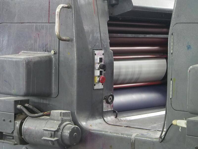
Color Printing Techniques for Posters
Emerging and traditional colour printing techniques contribute significantly to the quality and vibrancy of posters. Digital printing offers flexibility and quick turnaround times, making it suitable for small to medium-sized poster runs with intricate colour details. This method allows for precise colour matching and easy updates, ideal for campaigns requiring frequent modifications. Offset printing, on the other hand, excels in producing large quantities with consistent colour reproduction, especially when employing Pantone matching systems to ensure exact colour fidelity. Spot colour printing enables the use of specific pre-mixed inks for consistent and vibrant hues, especially for logos or branding colours that require high accuracy. Additionally, UV and aqueous coating techniques can be applied post-printing to enhance colour richness, add gloss or matte textures, and improve the poster’s durability in diverse environments. Understanding the strengths of each technique enables the creation of visually stunning posters tailored to your specific needs and display conditions.
Design Considerations for Colour Posters
The effectiveness of a colour poster hinges on thoughtful design choices that optimise colour utilization. Elements such as colour harmony, contrast, and saturation levels should be carefully balanced to create visual appeal without overwhelming viewers. Using a limited colour palette can help maintain consistency, improve focus on key elements, and simplify printing. Incorporating high-resolution images and vector graphics ensures clarity and vibrancy across large formats. Strategic placement of colours—placing warm hues next to cooler tones—can guide the viewer’s eye through the poster in a natural flow, enhancing message delivery. Incorporating white space effectively can also accentuate primary colours and prevent visual clutter. Moreover, ensuring that text colours contrast sufficiently with backgrounds is vital for readability. Collaborating with experienced designers who understand colour theory enhances the overall impact and professionalism of your poster, ensuring that it communicates your message powerfully across various display contexts.
Expert Techniques for Producing Accurate and Vivid Colour Posters
Implementing Effective Colour Management Protocols
Achieving precise colour reproduction in posters begins with meticulous colour management practices. This involves calibrating monitors regularly to ensure that the displayed colours are consistent and true to the intended design. Moreover, utilizing industry-standard colour profiles, such as ICC profiles, helps maintain colour fidelity across different devices and media. Color management workflows should be integrated throughout the design, proofing, and printing stages, providing a seamless transition from digital concept to physical poster.
Role of Proofing and Sample Prints
Before finalising a large-scale print, producing proof samples allows designers and clients to evaluate colour accuracy, contrast, and overall appearance. These proofs can be generated digitally or as physical samples, providing valuable insights into how colours will appear on the final poster. Adjustments can then be made to colour settings, ensuring that the printed product aligns perfectly with expectations. Proofing is an indispensable step in delivering high-quality colour posters that meet specific visual standards.
Ensuring Consistency Across Large Batches
For projects requiring multiple copies or large runs, maintaining consistent colour output is crucial. This demands consistent printer settings, regular calibration, and using the same high-quality printing materials throughout production. It is also important to monitor environmental factors such as lighting and humidity, which can influence colour perception and print quality. Working with reputable printing providers that employ the latest technology and adhere to strict quality control protocols can significantly enhance batch-to-batch consistency.
Advances in Colour Reproduction Technologies
Modern digital printing technologies, such as inkjet and latex printing, offer remarkable capabilities for achieving vibrant and true colours. These printers utilize advanced ink formulations and precise colour mixing to reproduce a broad gamut of hues with exceptional accuracy. Additionally, multi-layer printing techniques and specialty inks enable depth, gloss, and textured effects that enhance visual appeal. Understanding the strengths of each technology allows for selecting the optimal method aligned with your poster’s purpose, display environment, and budget.
Additional Considerations for Colour Accuracy
- Material Selection: Different printing substrates absorb inks differently, affecting colour vibrancy. Glossy papers tend to produce brighter colours, while matte finishes provide a softer, subdued effect.
- Lighting Conditions: The viewing environment influences how colours are perceived. Ensuring optimal lighting in display areas can prevent colour distortions.
- Post-Processing Enhancements: Applying coatings such as varnishes or laminates not only protects but can also intensify colours, adding depth and richness.