Overview of Color Poster Printing
Color poster printing is a specialized printing process that transforms digital designs into vibrant, high-quality posters suitable for various marketing, promotional, and informational purposes. This technique involves the application of multiple color layers to produce a wide spectrum of hues, ensuring that the final product is striking and visually appealing. In Singapore, where competition for consumer attention is intense, the significance of color poster printing cannot be overstated. It serves as an essential tool for businesses and organizations seeking to communicate messages effectively through bold visuals that stand out in both indoor and outdoor settings.
Color posters are widely used across a multitude of industries, including retail, events, hospitality, education, and corporate sectors. From eye-catching store displays and event banners to educational infographics and corporate announcements, the application of color poster printing is versatile and impactful. The ability to produce vibrant images and text that capture attention plays a vital role in brand recognition and campaign success.
Successful color poster printing involves meticulous planning and execution, leveraging advanced printing technologies and high-quality materials. The process begins with digital designing, where intent and message are translated into visual art, followed by a series of printing stages that aim to preserve color fidelity and image sharpness. Since posters often serve as focal points in promotional efforts, their visual impact largely depends on the accuracy of colors, the quality of the materials used, and the precision of the printing process.
In Singapore's competitive market, businesses are increasingly aware of the importance of high-caliber color posters that can withstand various environmental factors without fading or deterioration. Therefore, choosing the right printing method, materials, and design considerations are crucial to achieving a successful outcome. Understanding the principles behind color poster printing can help organizations make informed decisions, ensuring their visual communications are both compelling and effective.
Types of Printing Technologies Used
When selecting methods for color poster printing, understanding the distinct advantages of various printing technologies is essential. Each technology offers unique benefits tailored to specific needs, ensuring the final product aligns with the desired visual impact and operational requirements.
Digital Printing
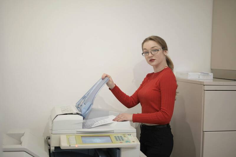
Digital printing has become a popular choice for short to medium print runs due to its speed, flexibility, and cost-efficiency. This method employs digital-based imagery directly from computer files, enabling quick turnaround times and minimal setup costs. It is highly suitable for personalized posters or projects with frequent design updates, as changes can be implemented swiftly without additional setup charges. The quality of digital prints is noteworthy, with vibrant colors and sharp details that meet professional standards. Digital systems are also effective for printing on a variety of materials, making them adaptable for diverse promotional needs.

Offset Printing
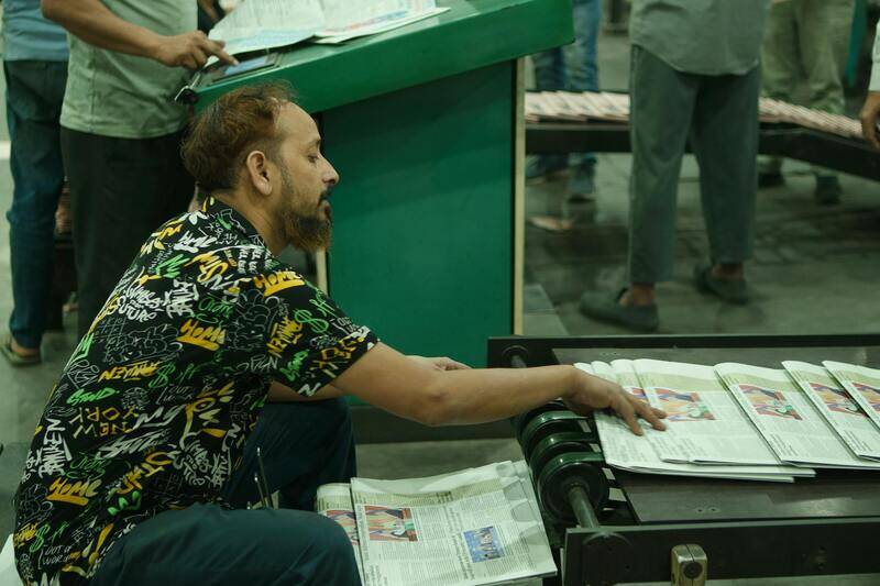
Offset printing remains a staple for producing large quantities of high-fidelity color posters. This process involves transferring ink from a plate to a rubber blanket, then onto the printing surface. Offset printing excels in achieving precise color reproduction and crisp image quality, making it ideal for campaigns requiring consistency across multiple copies. Although it demands longer setup times and higher initial costs compared to digital printing, offset is more economical for bulk orders, ensuring cost savings on volume production. It also offers excellent control over color accuracy, especially when utilizing Pantone matching or standardized color profiles.

Large-Format Printing
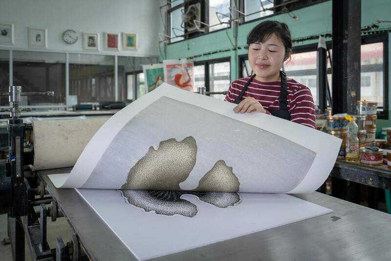
Encompassing both digital large-format and specialty printing, this technology is tailored for producing oversized posters that demand exceptional clarity and vibrant representation. Large-format printers are equipped to handle substantial media widths, making them perfect for billboard-sized advertisements or intricate event displays. These printers utilize advanced inkjet or solvent-based inks that ensure durability and color vibrancy even under challenging outdoor conditions. The ability to produce grand-scale posters without compromising detail makes this technology indispensable for impactful visual communication.
Informed selection between these printing methods depends on factors such as order volume, required quality, budget constraints, and physical poster dimensions. A strategic choice ensures that each poster not only stands out visually but also aligns with overall marketing and branding objectives.
Materials and Paper Options
Choosing the appropriate material is crucial in achieving the desired visual impact and longevity of color posters. Various paper stocks and finishes can significantly influence the appearance and durability of the final product. Glossy finishes are popular for their ability to enhance color vibrancy and provide a sleek, professional look. They reflect light, making colors appear more vivid, which is ideal for eye-catching advertisements and promotional displays.
Matte finishes, on the other hand, offer a subdued, sophisticated aesthetic with reduced glare, making them suitable for informational posters or environments with bright lighting. Matte surfaces also tend to hide fingerprints and smudges better, maintaining a clean appearance over time.
Satin or satin-gloss finishes strike a balance between gloss and matte, providing moderate sheen that enhances colors while reducing glare. They are versatile for a range of applications, from retail displays to event posters.
Material selection is also affected by environmental factors. For outdoor posters, weather-resistant media with waterproof and UV-resistant coatings ensure that colors stay vibrant despite exposure to sunlight, rain, or wind. Vinyl and polyethylene substrates are commonly used in these instances due to their durability and ability to withstand harsh conditions.
- Gloss Paper: Enhances color vibrancy, suitable for retail and promotional posters.
- Matte Paper: Reduces glare, suitable for detailed information and indoor displays.
- Satin Finish: Balanced option with moderate sheen, ideal for versatile applications.
- Weather-Resistant Media: UV and waterproof coatings for outdoor durability.
Considering the intended use, display environment, and desired aesthetic will help determine the most suitable material for your color poster printing project, ensuring both visual appeal and longevity.
Advanced Techniques for Optimizing Color Fidelity in Poster Printing
Achieving high color fidelity in poster printing requires meticulous attention to the entire production process. One of the foundational elements is rigorous color management, which includes standardized processes for calibration and profiling of monitors, printers, and printed materials. This ensures that the colors you see on your screen accurately translate into the final print, reducing discrepancies that can distort your intended message.
Implementing ICC (International Color Consortium) profiles tailored for specific printers and media is critical. These profiles serve as reference points that guide the printing device to reproduce colors as closely as possible to the original design. When the correct ICC profile is embedded in the digital file, the entire workflow maintains color consistency from design to print.
Beyond calibration and profiles, various techniques can enhance color vibrancy and accuracy. For instance, spot colors—such as Pantone—are often used for specific hues that are difficult to reproduce with standard CMYK inks. Incorporating spot colors into your design allows for precise matching of corporate brand colors or specific visual effects that require consistency across multiple prints.
Advanced printing technologies like high-resolution digital presses and wide-format printers equipped with multiple ink channels provide the capacity for detailed, vibrant color outputs. When paired with high-quality substrates and proper ink management, these tools help achieve rich, eye-catching graphics suitable for both indoor and outdoor displays.
The importance of proofing cannot be overstated. Proofs allow you to evaluate color accuracy before the full print run, enabling adjustments to be made to the digital file or printer settings. Conducting color proofs on the actual media intended for final output ensures the colors will appear as expected once printed at scale.
Emerging Trends in Color Post-Processing for Printed Posters
Recent advancements include the use of post-processing techniques that further refine color output. For example, over-coating with UV or clear varnishes can enhance the perceived vibrancy and protect the poster from environmental factors. These coatings can add gloss or matte effects, depending on the desired aesthetic, while also preserving the integrity of the printed colors over time.
Additionally, digital printing offers the flexibility to incorporate variable data and customized color gradients, which can be used creatively to produce visually dynamic posters. When properly managed with robust color workflows, these innovations can significantly elevate the visual impact of your displayed content.
Summary
Consistency in color reproduction relies on a combination of proper equipment calibration, accurate profile management, and strategic use of printing techniques. Investing in these practices guarantees vivid, true-to-design posters that captivate viewers and reinforce brand messaging effectively.
Selection of Appropriate Color Management Software
To ensure accurate color reproduction during the printing process, utilizing professional color management software is essential. These tools facilitate the creation of precise ICC profiles tailored to specific printers, inks, and substrates, enabling consistent color output across different print runs. Advanced color management systems also allow for detailed calibration workflows, minimizing color discrepancies caused by hardware variations. This consistency supports brand integrity and guarantees that the printed posters meet the original design specifications.

Calibration of Equipment and Regular Maintenance
Maintaining consistent color output begins with regular calibration of printing equipment. Calibration involves adjusting printer settings and color profiles to match standardized color grids, ensuring the colors produced align with the digital designs. Modern calibration tools, such as spectrophotometers and colorimeters, provide precise measurements and automate much of the process. Routine maintenance, including cleaning print heads and checking ink recirculation systems, reduces issues like color inconsistency and uneven coverage, ultimately preserving the fidelity of color reproduction.
Color Profiles and Color Matching Techniques
Creating and applying specific ICC (International Color Consortium) profiles for each print job is crucial. These profiles serve as a reference for translating digital colors into the printable gamut of the chosen media. Accurate color matching techniques involve soft-proofing—previewing how colors will appear once printed—using calibrated monitors and software. This process helps identify potential color conflicts early, allowing adjustments to digital files to ensure the final output closely mirrors the intended design. Employing spot colors for specific shades can further enhance color precision, especially in corporate branding or logo reproduction where exact hues are critical.
Quality Assurance and Final Proofing
Implementing a rigorous quality assurance process—including the use of color charts and test prints—can significantly improve color consistency across large print volumes. Digital proofs enable clients to review and approve the exact colors before the entire batch is produced, making it easier to catch inaccuracies and make necessary corrections. This step is vital in projects where color fidelity is paramount, such as advertising campaigns or artwork reproductions.
Emerging Technologies and Software Solutions
Advancements in color management include the integration of artificial intelligence (AI) algorithms that optimize color matching processes. These AI-driven solutions can analyze multiple variables, such as substrate type, ink properties, and environmental conditions, to suggest optimal settings and adjustments automatically. Cloud-based color workflow management platforms also offer real-time monitoring and remote calibration capabilities, streamlining the production process for large-scale printer fleets. By adopting these innovative technologies, print providers can consistently deliver vibrant, true-to-design posters that meet the highest standards of color fidelity.
Design Considerations for Color Posters
Creating visually striking and precise color posters requires careful attention to various design elements that influence the final printed result. Effective color poster printing begins with a comprehensive understanding of how to optimize design files, select appropriate color schemes, and prepare artwork to suit the chosen printing technology. Ensuring that design concepts translate accurately onto print materials involves multiple critical considerations.
Choosing the Right Color Schemes
Color harmony and contrast play significant roles in achieving eye-catching posters. Selecting a color palette that complements the poster’s purpose and target audience can enhance visual impact. Designers often utilize tools such as color wheels and digital color matching software to create balanced schemes that maintain vibrancy and readability.
Utilizing Accurate Color Profiles
Embedding the correct color profiles into artwork files ensures that colors are reproduced consistently across different devices and printing runs. Standard profiles like Adobe RGB or sRGB are commonly used in digital design, but for print purposes, CMYK profiles are preferred to match the ink output. Proper profile management minimizes discrepancies between the on-screen design and the final printed poster.
Preparing Files for Printing
- High-resolution Images: Incorporate images with a minimum of 300 DPI to maintain clarity and sharpness in large formats.
- Color Mode: Convert artwork to CMYK color mode to simulate how colors will appear post-printing.
- Bleed Zones: Include bleed areas around the artwork to facilitate edge-to-edge printing without unwanted white borders.
- Flattened Layers: Simplify complex layers and effects to prevent printing issues or color inconsistencies.
Calibration and Proofing
Regular calibration of monitors and printers ensures that digital colors align closely with printed results. Providing clients with calibrated proofs allows for validation of color accuracy before the final run, reducing wastage and costly reprints. Soft proofs, viewed on calibrated screens, are useful for initial approval, while hard proofs on actual print media offer the most reliable preview.

Best Practices and Tips for Successful Color Poster Printing
Achieving vibrant and precise colors in poster printing requires meticulous attention to several best practices that ensure consistency and quality. Implementing these strategies can significantly enhance the final output, making the posters visually compelling and professionally finished.
1. Accurate Color Profiling and File Preparation
Utilize standardized color profiles, such as Adobe RGB or sRGB, during the digital design process. For print, converting files to CMYK color mode is critical to predict how inks will reproduce on paper. Embedding the correct profiles minimizes color shifts and guarantees a close match between on-screen colors and printed results.
- Always use high-resolution images of at least 300 DPI for detailed and sharp visuals.
- Include bleed zones in the artwork—generally 3mm to 5mm—to allow for edge-to-edge printing and avoid unwanted borders.
- Simplify complex layers and effects to prevent potential printing issues, ensuring each element appears as intended.
2. Calibration and Proofing Processes
Regular calibration of devices involved in the printing workflow is essential. Calibrated monitors help designers view colors accurately, aligning digital designs with real-world print results. Proofing, both soft and hard, serves as a critical validation step before production:
- Soft proofs, viewed on calibrated screens, offer a preliminary assessment of color reproduction and layout.
- Hard proofs on actual print media allow for an accurate preview, enabling adjustments before the final print run.
3. Maintaining Consistency Across Batches
Creating a standardized workflow with consistent color management practices reduces variability across multiple print runs. This includes using the same printer settings, inks, and paper types for large or recurring projects. Consistent calibration routines for both digital displays and printing equipment ensure uniform results.
4. Selecting Appropriate Materials
The choice of paper or substrate significantly influences color vibrancy and durability. Glossy finishes tend to enhance color brightness and contrast, making visuals pop, while matte surfaces minimize glare and provide a more subdued aesthetic suitable for certain design styles. Additionally, selecting archival-quality materials can extend the lifespan of vibrant posters against environmental factors.
5. Collaborating with Trusted Printing Partners
Partnering with reputable printing providers who are experienced in color poster production ensures adherence to quality standards. Such providers employ advanced color management techniques, high-quality inks, and modern machinery, which collectively contribute to achieving visually striking posters with consistent color fidelity.
6. Final Review Before Production
Conduct a thorough review of the digital files, proofs, and sample prints to confirm color accuracy, layout, and overall quality. Checking for issues like unintended color shifts, pixelation, or misalignment at this stage minimizes waste and rework during the latter part of the process.
Recommended Methods for Authentic Color Poster Printing
Utilizing Certified Printing Services
When aiming for high-quality color poster outputs, engaging with renowned and certified printing service providers in Singapore is paramount. These providers often utilize advanced printing technology, such as large-format digital printers equipped with high-resolution capabilities and a broad spectrum of color reproduction. Certification from industry-standard organizations assures clients that the printer adheres to established quality and color management protocols, resulting in consistently vibrant and precise posters.
Working directly with specialists who have extensive experience in color poster production enables meticulous control over the printing process. Such professionals employ comprehensive color calibration routines, ensuring that the digital files' hue, saturation, and brightness are faithfully rendered onto the chosen medium. This level of expertise is crucial in large-scale projects, where uniformity across many posters can significantly influence branding consistency and visual impact.
Color Management Processes and Tools
Effective color poster printing depends on rigorous color management practices. This involves using standardized color profiles and calibration tools to align the digital file's color data with the output device's capabilities. Managing color profiles ensures that the hues viewed on a digital screen translate accurately to the physical print, effectively minimizing discrepancies caused by device variability. The employment of high-quality ICC profiles calibrated to the specific printer, ink, and paper combination dramatically enhances color fidelity.
Moreover, many printers employ spectrophotometers to measure and verify color accuracy before production begins. These devices provide precise color readings, enabling adjustments before the final run, thus guaranteeing that the printed posters meet the specified color standards.
Digital Files and Proofing
To ensure the fidelity of printed colors, providing digital files in correctly calibrated formats is essential. Manufacturers often recommend saving files in the Adobe RGB or sRGB color spaces, with embedded profiles, to maintain consistent color reproduction. Prior to the full print run, requesting a physical proof or sample is a critical step. High-quality proofs allow clients to assess color accuracy and overall visual effects, facilitating necessary adjustments before mass production.

Choosing the Right Printing Materials
Authentic color poster printing also hinges on selecting appropriate substrates. High-quality, coated paper or specialized materials designed for vibrant color reproduction provide a stable base for inks, contributing to vivid, durable images. Glossy finishes tend to elevate color vibrancy and contrast, making posters visually striking, whereas matte options offer a non-reflective surface suitable for reducing glare and enhancing readability.
Final Inspection and Quality Control
Implementing a rigorous quality control protocol, including final inspection of each poster for color consistency, sharpness, and color integrity, ensures clients receive printing outputs that exceed expectations. Good practice includes inspecting proofs under neutral lighting, verifying that color tones align with client specifications, and conducting spot checks on the printed materials.
By adhering to these official methods—partnering with experienced providers, utilizing comprehensive color management, conducting thorough proofing, and choosing the correct materials—businesses and individuals can achieve outstanding results in color poster printing that faithfully represent their intended design and branding elements.